What’s New on the Windows Desktop?
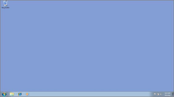
To best understand what’s new with the Windows 8 desktop, let’s take a quick look back at the Windows 7 desktop, shown in Figure 4‑1. This was the default (and only) user experience in the previous version of Windows, and aside from a few minor bits that differed between various product versions, this was essentially what all Windows 7 users saw when they booted into the operating system.
The Windows 7 desktop comprises a few key items, most of which hadn’t changed at all since Windows 95. These include one or more desktop icons (with Recycle Bin being the only icon pretty much guaranteed to appear every time), an optional selection of desktop gadgets (graphical utilities that would “float” over the desktop but under any open windows; these first appeared in Windows Vista), a Start button (or Start orb, as it was officially called), a taskbar, a system tray (with white notification icons and a clock), and the Aero Peek button, which temporarily hid the on‑screen windows so you could peek at the underlying desktop.
Figure 4‑1: The Windows 7 desktop

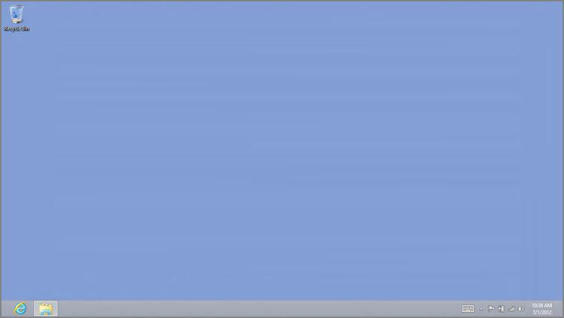
The Windows 8 desktop, perhaps not surprisingly, doesn’t look all that different. As you can see in Figure 4‑2, it looks almost identical to the Windows 7 desktop, though the Aero “glass” look and feel has been replaced with a flatter, more opaque, and somewhat Metro‑like user experience that is battery‑life friendly and a bit more consistent with the new Metro user experiences in Windows 8.
Figure 4‑2: The Windows 8 desktop looks and works like its predecessor, but with some minor differences.

Look a bit closer, however, and you will notice some other differences. For the most part, these differences involve user interface elements that were present in Windows 7 but are now missing in Windows 8. What’s interesting is that the two biggest–the Start and Aero Peek–are in fact still functionally available in Windows 8, even though they’re no longer visually there.
Дата добавления: 2015-05-13; просмотров: 1042;
