Using the Start Screen
The Start screen provides just a few basic functions: It’s a place to organize live tiles that represent the apps you care about the most, so you can launch those apps and, while viewing the Start screen, see live updates that are rendered on their surfaces.
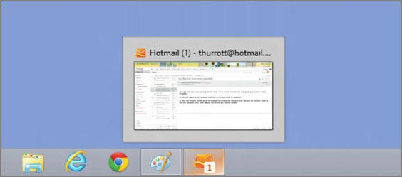
This functionality alone makes the Start screen far more useful than the Windows desktop. With that interface, applications had very limited ways in which to provide you with any kind of status information. An e‑mail application, for example, might provide a small number badge on its icon, indicating how many unread e‑mails it contained. But this badge could be seen only when you pinned the application to the taskbar, as in Figure 3‑7.
Application developers tried to overcome this lack of capability through several means. Many wrote customized notification schemes that could alert users when something important happened, but the sheer number of variety of these notifications was often more annoying and distracting than useful. And Microsoft even briefly pushed a new type of utility, called the Windows Gadget, which would sit on the desktop and update the user from time to time. Gadgets failed for all kinds of reasons: Full‑screen applications would cover them up, they were disconnected from full‑fledged Windows applications, and they were written with completely different technologies.
Figure 3‑7: In Windows 7, an e‑mail application could provide you with an unread e‑mail count through its taskbar button’s icon.

In Windows 8, each app (and many desktop‑based interfaces) can expose a single live tile on the Start screen. This live tile is more expressive and useful than any icon and can provide all kinds of information in real time. By arranging the tiles for apps you use most often, you can create a live dashboard of sorts where your e‑mail, calendar, social networking, weather, and other apps are all providing you with ongoing live updates over time. And you can see these updates without ever entering the app in question. Glance and go, as Microsoft says.
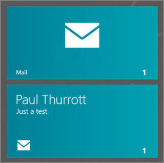
To use the previous e‑mail example again, Windows 8 includes an app called Mail. And unlike its desktop‑based predecessor, it not only tells you how many unread e‑mails you have, but it also cycles through previews of each of those e‑mails. In Figure 3‑8, you can see two of the different types of displays it animates between.
In the smaller size, a normally expressive live tile is effectively rendered mute.
Figure 3‑8: The Mail app cycles through previews of your most recent e‑mails; here are two examples from the same tile.

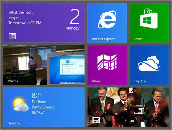
Not all live tiles are expressive. Some don’t have to be, like the tile for a game or web browser. You can configure tiles to be one of two sizes–Bigger and Smaller, with the former being rectangles and the latter being smaller squares.
Consider Figure 3‑9, where you can see a grid of live tiles, some big and some small. Here, the Internet Explorer, Windows Store, Bing Maps, and SkyDrive Explorer tiles are all configured to be smaller and don’t provide any rich, animated information. But the Calendar, Photos, Weather, and Bing Finance live tiles are larger and provide dynamic information about their contents.
Figure 3‑9: A mix of small and large live tile sizes

The Start screen can be configured in various ways so you can tailor the system as you prefer. For example, you can organize the tiles visually into various groups, and can add and remove tiles for the apps (and Windows desktop applications and websites) you use most frequently.
Дата добавления: 2015-05-13; просмотров: 1106;
