Understanding the Design of Metro
The Start screen is what’s called a Metro‑style user experience. That is, it employs the techniques of a new “design language” at Microsoft that is guiding the look and feel of many of the software giant’s core platforms, including Windows, Windows Server, Windows Phone, Xbox, and Office. And while we don’t want to get too bogged down in designer talk, it’s worth noting a few general tenets of these interfaces, since they’re so pervasive in Windows 8.
• Typography and white space: Metro‑based user experiences feature beautiful typography, often surrounded by lots of white space. This is a very different approach than with typical technology interfaces, which tend to overwhelm users with obscure rows or grids of icons, buttons, and other on‑screen elements.
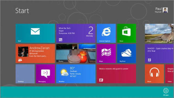
Consider the Start screen as a typical example. The Start logo and user tile (in the upper‑right corner) are offset deliberately from the live tiles below by a wide swath of white space. Those tiles don’t butt up to the left edge of the screen, but rather sit to the right. But the tiles also appear to disappear off the right edge of the screen, suggesting that you can scroll in that direction to see more. There’s no awful looking chevron graphic or whatever to spell it out for you. Instead, the design is confident and beautiful, and something that would be fun to touch.
• Animation and motion: Interfaces come to life with animation and other motion, and in Metro these motions aren’t just fun to look at, they’re useful. Animation can also give the appearance of performance, though to be fair, Windows 8 performs so well it’s almost redundant.
It’s not possible to show you how animations and motion improve the Windows 8 user experience, but suffice to say these elements are everywhere, from the live tiles that animate between various status updates, to the animation that occurs each time you launch a Metro‑style app, and to the floating notification “toasts” that slide on‑screen rather than jar you by appearing suddenly and without warning.
• Minimal user interface chrome: Until recently, most computer software was designed by the engineers who wrote the code. And let’s face it, these guys don’t get good design. They were responsible for such UI extremes as the dialog with multiple rows of tabs and the Office applications so loaded up with toolbars you couldn’t even see the document you were supposed to be editing.
With Metro, it’s the content that’s emphasized, not the surrounding application user interface, or chrome . In fact, with most Metro‑style designs, there is little to no chrome at all. Instead, Metro provides full‑screen experiences that use every available pixel to display the app or experience. Accessory interfaces that used to be on‑screen all the time, like an app bar–Metro’s all‑in‑one replacement for the toolbar and menu–are now hidden by default and displayed only when needed.
For example, in Figure 3‑6, you can see the Start screen’s app bar, which is not normally shown since its few options are rarely needed.
Figure 3‑6: The Start screen’s app bar
• Honesty of design: While some systems treat their users like idiots, Metro design specifies that user interfaces should be “authentically digital” and true to the system on which they run. That is, your $1,000 Ultrabook isn’t a paper‑based calendar. Why should a calendar app be designed to resemble one? After all, most users today have never even used such a calendar, so that design is at best nostalgic and at worst inefficient. Instead, Metro designs are designed explicitly for the device form factor: a high‑resolution, high‑performance screen that could employ multi‑touch interactions. On such a device, a calendar could look very different from that old‑fashioned paper calendar that some companies seem to like so much.
And yes, this is where Metro gets its name. It’s based on the simple graphics found in the transportation hubs that people use every day.
You can see this type of design throughout Metro, but the best example, perhaps, is in the various opaque icons that appear throughout, in such places as the live tiles on the Start screen and the buttons on various app bars. Instead of being photorealistic representations of a store (Windows Store), a pair of headphones (the Xbox Music app), or a video game controller (Xbox LIVE Games app), these icons are authentic to the digital nature of the device itself. In fact, they’re designed to be as obvious as possible, and are modeled on the signage one sees in public transportation hubs throughout the world.
Дата добавления: 2015-05-13; просмотров: 1126;