Understanding the New File Explorer
File Explorer debuted (as Windows Explorer) in Windows 95, but Windows has of course always had a graphical interface for managing files and folders. In fact, even the first version of Windows, dating all the way back to 1985, included a basic file manager application called MS‑DOS Executive.
While File Explorer was evolved over previous Windows versions, it’s been thoroughly overhauled with a new, Metro‑like and ribbon‑based UI in Windows 8, and as a result, this version is the best yet. But don’t take our word for it. Let’s compare the Windows 8 version of Explorer to Windows Explorer from Windows 7 to better understand what’s changed.
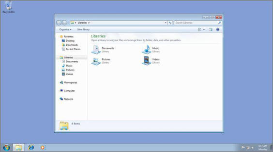
First, take a look at Windows 7. As you can see in Figure 4‑19, this version of File Explorer is streamlined, with most advanced options hidden under the Organize command bar item.
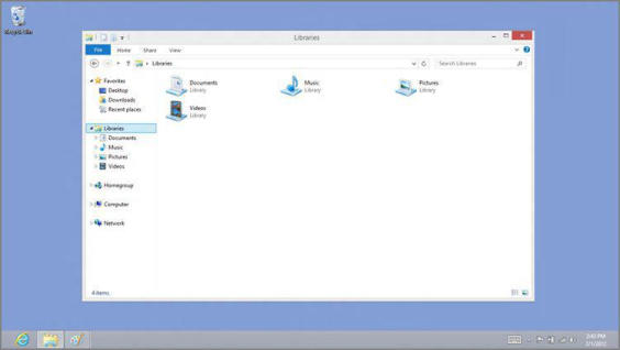
In Windows 8, Explorer drops the Aero glass and adopts the new ribbon‑based UI, replacing the previous version’s command bar with a more powerful but denser interface that puts all the options you’ll ever need–and then some–right up front. Fortunately, thanks to feedback during the Windows 8 prerelease cycle, Microsoft opted to hide the ribbon by default. So the Explorer UI you’ll probably see the first time you use this application will likely resemble the one shown in Figure 4‑20.
Figure 4‑19: Explorer from Windows 7

Figure 4‑20: The Windows 8 Explorer has a ribbon UI, but it’s hidden by default.

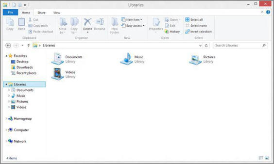
To expand the ribbon and see more commands, click the Expand the Ribbon control in the top‑right corner of the window. (It resembles a downward‑pointing arrow. You can also type Ctrl + F1.) When you expand the ribbon UI, File Explorer will resemble Figure 4‑21.
Other tabs are possible. For example, if you select an image file, you’ll see a Manage: Picture Tools tab appear. Select a disk and Drive: Disk Tools appears.
Interestingly, what you see here only represents a subset of the commands that are available in the new File Explorer. And that’s because the ribbon has several tabs, and only one of them–Home, in this case–is displayed at a time. You can click the other two tabs that are always available, Share and View, to see the commands they provide.
Figure 4‑21: With the ribbon displayed, far more commands are readily available.

While it would be overly pedantic to step through every single command in this interface–we do have certain assumptions about your capabilities, after all–a short discussion of each of the new default tabs is perhaps in order.
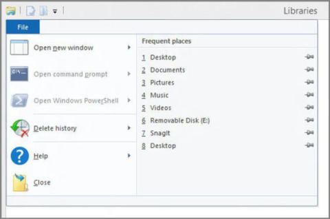
You can also access Explorer’s Frequent Places list from this menu. This list is otherwise available via the File Explorer taskbar button.
First, there’s a tab that’s not a tab: The colored File tab is really a button that displays the new File menu. Shown in Figure 4‑22, this menu provides several useful options, including the ability to open a new window, ideal for side‑by‑side file copying, open a command prompt or PowerShell window, delete the history in your recent places and address bar history lists, and access help.
Figure 4‑22: The new File Explorer File menu

You can jump quickly to the Home tab from another Explorer tab by tapping Alt + H.
Next, the Home tab includes the most commonly needed commands related to files and folders, and for the most part, this is the obvious place to start if you’re a heavy mouse user and like to click on icons to initiate actions, such as Move to, Copy to, and Rename.
Need to access Share quickly? Type Alt + S.
The Share tab contains commands related to sharing, of course, and for this reason it’s a location you most likely won’t be using very often.
The View tab can be displayed by typing Alt + V.
The View tab, conversely, contains a number of commands we wish were more easily accessible, including the various icon sizes–Extra Large Icons, Large Icons, Medium Icons, Small Icons, List, Tiles, Details, and Content–and the various grouping options. It’s perhaps not coincidental that File Explorer has a miniature set of buttons in the status bar in the lower‑right corner of the window that lets you toggle between two of the most common icon sizes, Details and Large Icons.
NOTE
If you enjoy creating your own libraries, Windows 8 does have a new feature where you can customize a library’s icon to any icon in the system, offering a much more personalized look.
Put simply, the File Explorer ribbon is something that new users should leave displayed until they’re comfortable with the new interface. But power users will likely want to keep it hidden and enjoy the simpler interface afforded by this configuration.
NOTE
Hidden in the upper‑left corner of the File Explorer window is a new Quick Access Toolbar, which can be customized with the commands you need most often. That’s ideal for power users who want to hide the ribbon but also want access to a handful of useful commands.
OK, it’s time to see what you can really do with this thing. While most of the behaviors you’ll see in File Explorer are the same as with previous Windows versions, there have been some key changes and improvements as well. In keeping with the focus of this book, we’ll assume that you understand the basics, and how things used to work, and highlight only these new features.
Дата добавления: 2015-05-13; просмотров: 1139;
