Diving a Bit Deeper
As you browse around Windows Store’s virtual storefront, you’ll eventually see something that strikes your fancy and you will want to dive a bit deeper. There are basically three paths you can take from the Windows Store home screen and arrive at a different type of landing page. These include landing pages for categories, lists, and apps. So let’s look at each.
Browsing by Category
Each category has its own landing page that provides a list of the apps within that category that are sortable by subcategories, prices, and/or other criteria (noteworthy, newest, highest rating, lowest price, and highest price). Accessing a category landing page, curiously, isn’t very obvious: You need to tap or click the category title on the Windows Store home screen.
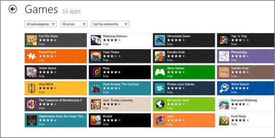
The view is fairly consistent between categories, and you’ll see the same basic user interface elements on each category landing page, as you can see in Figure 6‑6.
These elements include the following:
• Back: A browser‑style back button that persists throughout the Windows Store UI, letting you quickly navigate back to the previous screen. In the case of a category landing page, tapping this button will return you to the Windows Store home screen.
• Category title: A non‑clickable title that indicates which category you’re viewing.
• App count: Next to the category title, you will see an app counter listing how many apps there are in the current category. This number changes if you filter the list as described shortly.
Figure 6‑6: The landing page for the Games category.
• Subcategory filter: This widget lets you filter the current view so that it displays only apps of the selected subcategory. Available subcategories vary by category, of course. Games includes subcategories like Action, Adventure, Arcade, Card, Casino, and many, many more. A category view filtered with a subcategory will resemble Figure 6‑7.
Figure 6‑7: Viewing a subcategory only

• Price filter: With this widget, you can filter by price with available choices being free, free and trial, and paid.
• Sort filter: The sort filter is probably the least obvious but has some useful choices: Sort by noteworthy, newest, highest rating, lowest price, and highest price.
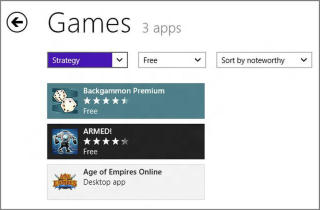
In case it’s not obvious, you can filter the view by any combination of subcategory, price, and sort. So you could, for example, view only noteworthy, free, strategy games if that’s what you’re looking for. This is shown in Figure 6‑8.
Figure 6‑8: That’s exactly the game I was looking for!
Browsing by List
In many of the category groups on the Windows Store homepage, you’ll see colored tiles that represent app lists that are specially curated by Microsoft because they believe they’ll be interesting to users. There are some regular lists that will often be available, such as Top free and Top paid, and then promotional lists that appear from time to time. It’s not hard to imagine lists related to a holiday like Halloween, a major game release like the next Halo, or similar.
In Figure 6‑9, you can see six such list tiles mixed in with tiles for individual games in the Spotlight group. These lists include Great apps for Windows 8, All Stars, New releases, Top free, Picks for you, and Rising stars.
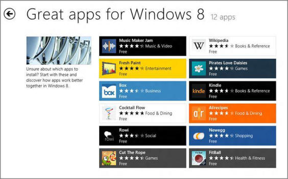
When you view a list landing page, it looks a lot like the landing page for a category. There are Back, List title, and App count elements, as well as a grid of app tiles. Some of these list landing pages also include a nice textual description of the list so you can better understand what you’re looking at, as shown in Figure 6‑10.
What’s missing here is any filtering: These list landing pages don’t include the subcategory, price, and sort filters you see on a category landing page.
Figure 6‑9: List tiles mixed in with tiles for individual games
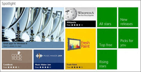
Figure 6‑10: A list landing page
Browsing by App
Eventually, it all comes down to an individual app. You can reach an app landing page via a direct link on the Windows Store home screen or by tapping its tile on a category or list landing page. In Figure 6‑11, you can see the landing page for an app.
Figure 6‑11: An app landing page
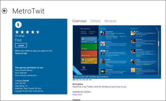
These app landing pages, like those for categories and lists, feature some common elements. These elements include:
• Back: A browser‑like Back button that will return you to the previous page.
• App title: Non‑interactive title text providing the name of the app.
• Navigational breadcrumbs: Below the app title, you’ll see two or more breadcrumb hyperlinks, providing you with both the exact location of the app in the store (like Home → Games → Puzzle) and a way to jump back to any location in the store above the app. That is, you can tap Home, Game, or Puzzle in the previously cited example and navigate directly to one of those locations.
• Overview view: The default view provides one or more screenshots, a description and feature list, and, optionally, other information such as links to the app website, app support, and feedback.
The permissions list is worth looking at. Many apps will require access to your Internet connection, but some of the other possible permissions include access to your home or work network, your music library, and the like.
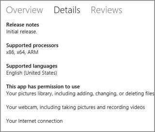
• Details view: Tap the Details header and the display will change to show you the app’s release notes, supported processor(s) (x86, x64 and/or ARM), supported language(s), permissions, accessibility (if available), and terms of use. A typical app details view is shown in Figure 6‑12.
Figure 6‑12: The Details view for an app
• Reviews view: Tap the Reviews header and you’ll navigate to each of the reviews, and associated ratings, for the app. This list of reviews is sorted by newest by default, as shown in Figure 6‑13, but it can be sorted by oldest, highest rated, lowest rated, or most helpful if desired.
Figure 6‑13: The Reviews page for an app

We examine app reviews and other feedback a bit later in the chapter.
• Buy, Try, and Install button(s): In the left pane of the default Overview view, you’ll see one or more buttons related to downloading the app. These include Buy, Try, and Install. We look at app downloading and updating later in this chapter.
Дата добавления: 2015-05-13; просмотров: 1132;