SetText
Here, we attach the activity itself as the selection listener (). This works because the activity implements the interface. We configure the adapter not only with the list of fake words, but also with a specific resource to use for the drop‑down view (via ). Also note the use of as the built‑in View for showing items in the spinner itself. Finally, we implement the callbacks required by to adjust the selection label based on user input.
The resulting application is shown in Figures 8‑2 and 8‑3.
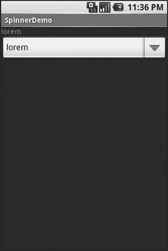
Figure 8‑2. The SpinnerDemo sample application, as initially launched
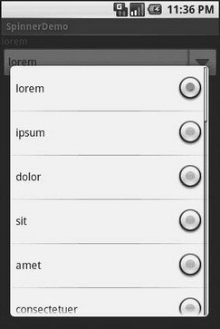
Figure 8‑3. The same application, with the spinner drop‑down list displayed
Grid Your Lions (or Something Like That…)
As the name suggests, gives you a two‑dimensional grid of items to choose from. You have moderate control over the number and size of the columns; the number of rows is dynamically determined based on the number of items the supplied adapter says are available for viewing.
There are a few properties which, when combined, determine the number of columns and their sizes:
• spells out how many columns there are, or, if you supply a value of , Android will compute the number of columns based on available space and the following properties.
• and its counterpart indicate how much whitespace there should be between items in the grid.
• indicates how many pixels wide each column should be.
• indicates, for grids with auto_fit for , what should happen for any available space not taken up by columns or spacing – this should be to have the columns take up available space or to have the whitespace between columns absorb extra space. For example, suppose the screen is 320 pixels wide, and we have set to and set to . Three columns would use 310 pixels (three columns of 100 pixels and two whitespaces of 5 pixels). With set to , the three columns will each expand by 3–4 pixels to use up the remaining 10 pixels. With set to , the two will each grow by 5 pixels to consume the remaining 10 pixels.
Otherwise, the works much like any other selection widget – use to provide the data and child views, invoke to register a selection listener, etc.
For example, here is a XML layout from the sample project, showing a configuration:
For this grid, we take up the entire screen except for what our selection label requires. The number of columns is computed by Android () based on 5‑pixel horizontal spacing (), 100‑pixel columns (), with the columns absorbing any “slop” width left over ().
The Java code to configure the is:
Дата добавления: 2015-05-16; просмотров: 1092;