Scrollwork
Phone screens tend to be small, which requires developers to use some tricks to present a lot of information in the limited available space. One trick for doing this is to use scrolling, so only part of the information is visible at one time, and the rest is available via scrolling up or down.
is a container that provides scrolling for its contents. You can take a layout that might be too big for some screens, wrap it in a , and still use your existing layout logic. It just so happens that the user can see only part of your layout at one time; the rest is available via scrolling.
For example, here is a used in an XML layout file (from the demo in the Source Code area of http://apress.com):
Without the , the table would take up at least 560 pixels (7 rows at 80 pixels each, based on the declarations). There may be some devices with screens capable of showing that much information, but many will be smaller. The lets us keep the table as is, but present only part of it at a time.
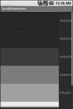
On the stock Android emulator, when the activity is first viewed, you see what’s shown in Figure 7‑8.

Figure 7‑8. The ScrollViewDemo sample application
Notice how only five rows and part of the sixth are visible. By pressing the up/down buttons on the directional pad, you can scroll up and down to see the remaining rows. Also note how the right side of the content gets clipped by the scrollbar – be sure to put some padding on that side or otherwise ensure your own content does not get clipped in that fashion.
Дата добавления: 2015-05-16; просмотров: 823;
