RelativeLayout Example
With all that in mind, let’s examine a typical “form” with a field, a label, plus a pair of buttons labeled “OK” and “Cancel.”
Here is the XML layout, pulled from the sample project:
<?xml version="1.0" encoding="utf‑8"?>
First we open up the . In this case, we want to use the full width of the screen (), use only as much height as we need (), and have a 5‑pixel pad between the boundaries of the container and its contents ().
Next we define the label, which is fairly basic, except for its own 15‑pixel padding (). More on that in a moment.
After that we add in the field. We want the field to be to the right of the label, have both the field and label text aligned along the baseline, and for the field to take up the rest of this “row” in the layout. Those components are handled by three properties:
•
•
•
If we were to skip the 15‑pixel padding on the label, we would find that the top of the field is clipped off. That’s because of the 5‑pixel padding on the container itself. The property simply aligns the baselines of the label and field. The label, by default, has its top aligned with the top of the parent. But the label is shorter than the field because of the field’s box. Since the field is dependent on the label’s position and the label’s position is already defined (because it appeared first in the XML), the field winds up being too high and has the top of its box clipped off by the container’s padding.
You may find yourself running into these sorts of problems as you try to get your to behave the way you want it to.
The solution to this conundrum, used in the XML layout shown earlier in this section, is to give the label 15 pixels’ worth of padding on the top. This pushes the label down far enough that the field will not get clipped.
Here are some points of note:
• You cannot use on the field, because you cannot have two properties that both attempt to set the vertical position of the field. In this case, conflicts with the later property, and the last one in wins. So, you either have the top aligned properly or the baselines aligned properly, but not both.
• You cannot define the field first, then put the label to the left of the field, because you cannot “forward‑reference” labeled widgets – you must define the widget before you can reference it by its ID.
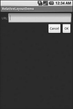
Going back to the example, the OK button is set to be below the field () and have its right side align with the right side of the field (). The Cancel button is set to be to the left of the OK button () and have its top aligned with the OK button ().
With no changes to the auto‑generated Java code, the emulator gives us the result shown in Figure 7‑6.

Figure 7‑6. The RelativeLayoutDemo sample application
Дата добавления: 2015-05-16; просмотров: 970;
