SetText getString
This means the fields will be updated when the activity is opened and after the preferences activity is left (e.g., via the back button); see Figure 17‑3.
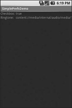
Figure 17‑3. The Simple project’s list of saved preferences
Adding a Wee Bit o’ Structure
If you have a lot of preferences for users to set, having them all in one big list may become troublesome. Android’s preference framework gives you a few ways to impose a bit of structure on your bag of preferences, including categories and screens.
Categories are added via a element in your preference XML and are used to group together related preferences. Rather than have your preferences all as children of the root , you can put a few elements in the , and then put your preferences in their appropriate categories. Visually, this adds a divider with the category title between groups of preferences.
If you have lots and lots of preferences – more than is convenient for users to scroll through – you can also put them on separate “screens” by introducing the element.
Yes, that element.
Any children of go on their own screen. If you nest , the parent screen displays the screen as a placeholder entry – tapping that entry brings up the child screen. For example, from the sample project on the Apress Web site, here is a preference XML file that contains both and nested elements:
The result, when you use this preference XML with your implementation, is a categorized list of elements like those in Figure 17‑4.
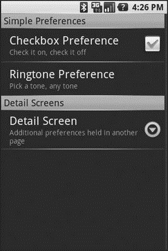
Figure 17‑4. The Structured project’s preference UI, showing categories and a screen placeholder
And if you tap on the Detail Screen entry, you are taken to the child preference screen (Figure 17‑5).
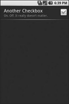
Figure 17‑5. The child preference screen of the Structured project’s preference UI
The Kind of Pop‑Ups You Like
Of course, not all preferences are checkboxes and ringtones.
For others, like entry fields and lists, Android uses pop‑up dialogs. Users do not enter their preference directly in the preference UI activity, but rather tap on a preference, fill in a value, and click OK to commit the change.
Structurally, in the preference XML, fields and lists are not significantly different from other preference types, as seen in this preference XML from the sample project available at http://apress.com:
With the field (), in addition to the title and summary you put on the preference itself, you can also supply the title to use for the dialog.
With the list (), you supply both a dialog title and two string‑array resources: one for the display names, one for the values. These need to be in the same order – the index of the chosen display name determines which value is stored as the preference in the . For example, here are the arrays for use by the shown previously:
When you bring up the preference UI, you start with another category with another pair of preference entries (see Figure 17‑6).
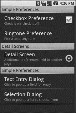
Figure 17‑6. The preference screen of the Dialogs project’s preference UI
Tapping the Text Entry Dialog preference brings up… a text‑entry dialog – in this case, with the prior preference entry pre–filled in (Figure 17‑7).
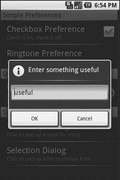
Figure 17‑7. Editing a text preference
Tapping the Selection Dialog preference brings up… a selection dialog, showing the display names (Figure 17‑8).
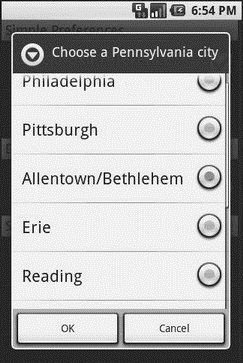
Figure 17‑8. Editing a list preference
Дата добавления: 2015-05-16; просмотров: 1128;