Interview: Website Designer
Many companies now have a website to advertise their goods and services and provide information to their customers. It is therefore becoming important to have a website as good as your competitors.
A lot of work has to be done to create a good website. The individual webpages have to be created using a language called hypertext markup language or HTML, and the individual webpages have to be linked together using hyperlinks. It takes a combination of technical knowledge and artistic skill to make webpages look good. The layout of a sophisticated webpage might contain a combination of text, graphics, animation, and other multimedia elements.
Rather than creating a website yourself, you can pay a web designer to create the site for you. The web designer must first find out what information you want to provide on the website, and the target audience he or she is designing for. Depending on this information, the designer will decide what kin of information should be displayed on each webpage, and how these pages should be linked. Navigation icons may be displayed on each webpage to make it easier for users to move to different parts of the website. Every page must have a link that will let users move to another page.
However, if too many links are needed to get to a page, the user may decide it is not worthwhile. Pages have to be kept short enough so that the user does not have to do a lot of scrolling. Remember that it will take time and cost money to keep the website up to date.
Multimedia features make the page look nicer and more interesting, but they take longer for the user to browse. Some multimedia features also require the user to install additional programs known as add-ons, which work in the browser to enable the multimedia features to be used. Each webpage has to be downloaded from the web server before it can be displayed on the screen. It is therefore advisable to divide information into small sections to suit the display screen, save downloading time, and simplify printing. The first page of a website should be simple and tell the reader who the website owner is. If links to other websites are included, people are more likely to come back to your site.
Website designers like the one interviewed in this unit are experienced in creating websites that take all of these factors into consideration.
15Interview:Websitedesigner
Tuning-in
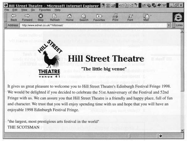
Task 1 Saladin designs websites. This is one of his designs. Discuss with your group what you think a good website should have.

Listening
Task 2 In this interview Saladin describes what makes a good website. Listen to Part 1 of the interview and answer these questions.
1 Name two kinds of people who want websites.
2 Why is a website good for people with a lot of information to distribute?
3 What sort of clients is a website particularly useful for?
4 What does Saladin ask for first from a client?
5 What important point must be decided?
6 What must the client make a clear decision about?
Task 3 Listen to Part 2 of the interview and complete the five design principles mentioned.
1 There should never be ________ .
2 A maximum of _________ from home page to other pages.
3 Don't have _____________on one page.
4 Don't use multimedia simply to make_________ .
5 Remember there are still a lot of users with__________ .
Task 4 Listen to Part 3 of the interview. Decide which of these statements Saladin would agree with.
1 Information on websites should be divided into small sections.
2 Long sections can be a problem for users who want to print from a website.
3 It's a bad idea to have a lot of links to other sites.
4 You want users to bookmark your site as a way to get to other sites.
5 Your website should start with a brief piece of information to attract the reader.
Task 5 Now listen to the whole interview again. Put these pieces of advice about website design into two sets: A (things to do) and В (things not to do).
1 Include graphics only to make it look nice.
2 Divide information into small sections.
3 Have pages with dead-ends.
4 Have a lot of links to other sites.
5 Have a lot of links on one page.
6 Start with a brief piece of information to attract the reader.
7 Forget about readers with less sophisticated browsers.
8 Update your page regularly.
| Language work: Indicating importance We use has/have to and must to urge someone to do something because we feel it is important. You have to/must put the keyboard directly in front of you. You mustn't type for hours without a break. We also use these words to show that something is required by a rule or law or by common sense. The screen has to/must be easy to read. Noisy printers mustn't be too near. |
Task 6 Give advice about website design using has/have to, must, and mustn't. Use these answers to Task 5 to help you.
| <== предыдущая лекция | | | следующая лекция ==> |
| The Internet 2: the World Wide Web | | | Databases and spreadsheets |
Дата добавления: 2016-04-26; просмотров: 1808;
